HiLo
Making a Task Managing App with Mental Health in Mind
HCDE 318: Introduction to User-Centered Design
September - December 2019
Group Work
App Design | User Research | Wireframes
Overview
Overarching Question:
How can we help disadvantaged students?
Actions and Deliverables We Took
Interviews
Personas
User Journey Maps
Story Boards
Design Requirements
Information Architecture
Paper Prototypes
Annotated Wireframes
High Fidelity Mockups
Group Work vs Individual Actions
This was a group project, with 4 members total. Interviews and storyboards were created individually, while the rest were done collaboratively. Within the collaborative works, I focused primarily on design requirements, paper prototypes, and annotated wireframes.

Interviews
Who did we interview?
7 Students
Mostly Students of Color
Low Income Students
3/7 Use DRS (The UW Disability Services)
What are we looking for?
What are the stressors of low income students?
What were their stresses?
Coordinating different online schoolwork, financial aid, and personal schedules
Time-management, overextending themselves, burnout
Valuing self-care and mental health
Personas
From the interviews, we created 2 personas that represent two different types of overwhelmed students we found
Aliyah:
High achieving
Has too many events and leadership activities to stay on top of
Struggling with burnout
Fernando:
Overwhelmed by school and work
Feels isolated
Struggling to get accommodations from DRS
Why make Personas?
Personas consolidates the interview data
We have specific reference points to refer to as our users


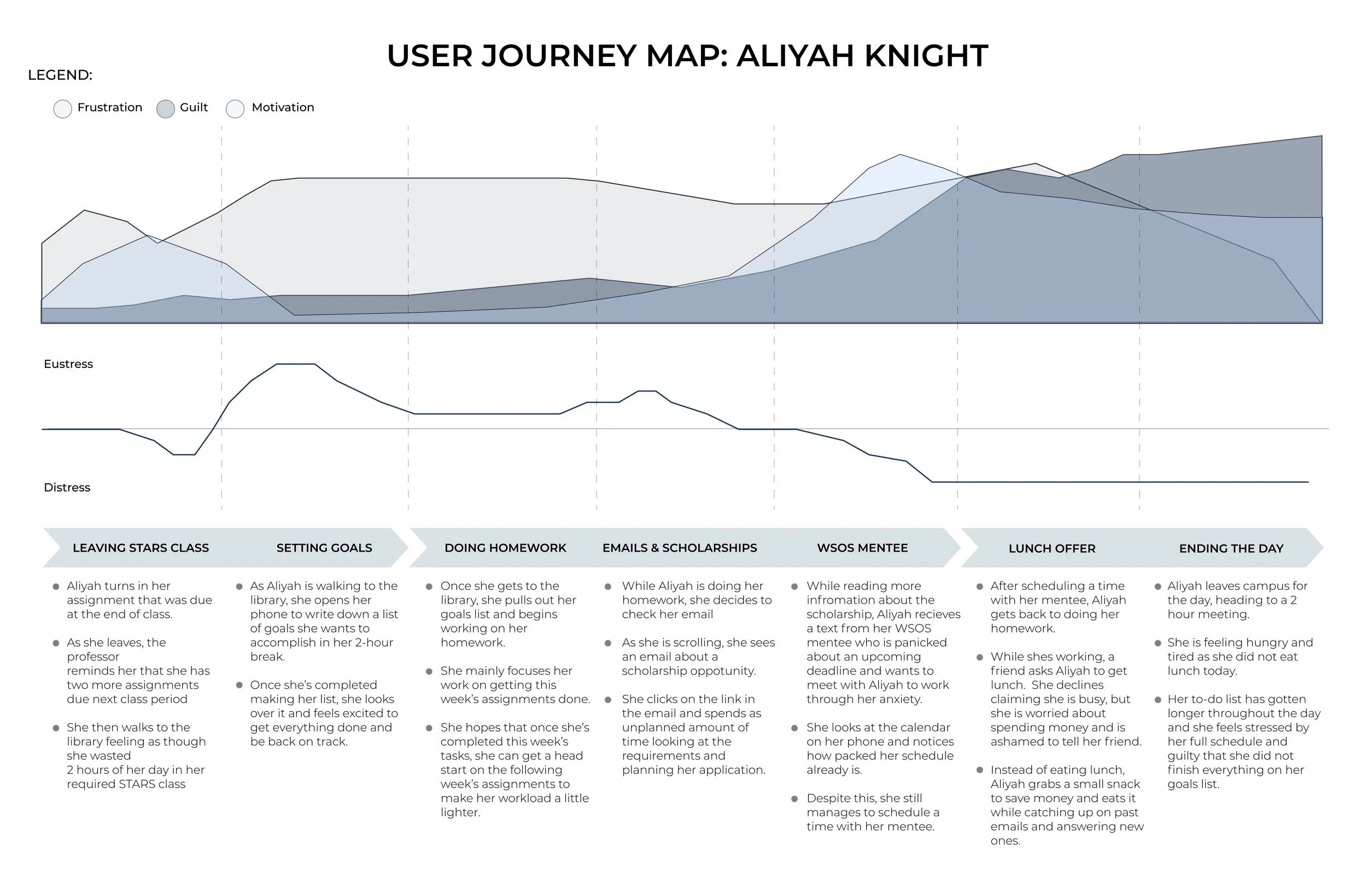
User Journey Map
To get in depth, we needed to think of a specific scenario where our user runs into issues.
Scenario:
Doing homework at the library after a long day
Stressors and events:
Spending unexpected time on emails
Dealing with her WSOS mentee
A lunch offer she can’t afford to take
Measures:
Frustration
Guilt
Motivation
Eustress vs Stress
Why do this?
Get into the mind of a user
See their struggles
Realize their pain points and where we might help

Storyboarding
To continue getting into the mind of the user, we each made storyboards.
My Storyboard:
My storyboard shows a student getting overwhelmed by DRS’s instructions for how to get accommodations. He takes a picture of the instructions, which his app analyzes and breaks down into simple tasks, and highlights what to do first.
Why do this?
We could ideate ways our app could help the user
We could see each others visions for how our app might work

Design Requirements
With our research and ideation done, we needed to create a framework of what our app should be. This was a moment of consolidation and teamwork. We all had developed individual ideas for our app, and in this deliverable we narrowed down into one design concept.
What does our app do?
Helps student navigate the stress of college life
Is sensitive to stress and mental health
Manage student tasks
We wanted the app to be an assistant to the student, managing low level tasks.

Information Architecture
With our design in mind, we made the information architecture.
Blue: Login
Log in
If user doesn’t have an account, sign up
Put in larger schedules, such as linking to canvas, so the app can keep up with the students assignments
Yellow: Home
Each day, the student is checked in on and they can input how they’re doing - stressed, motivated, etc
Green: Adding a Task
When a student is adding a task, they can get an automatically made task, by inputting a link or photo of the task
They can also manually make a task
Grey (and Dark Red): Task Details
This is an individual task and it’s infomation
The student can:
Complete the task
Edit the task
Break up the task into smaller, more manageable tasks
Red: Settings
Update personal info and notifications
Turquoise: Resources
Mental health resources
Paper Prototypes
With the high level concepts done, we needed a physical visual of the app
Main Pages:
Opening up the app, seeing progress, finding task
Progress: We wanted a way to show progress, and came up with a mountain metaphor. Each task completed gets a mountain thats added to progress, showing the student how they’ve been working


Looking at a Task:
Show suggested tasks
Show task details
Edit task
Complete task


Add a Task:
Choose how to input task
Take a picture of task
Edit and finalize task


Critiques
What Does That Mean?
Our ‘time’ and ‘stress’ markers aren’t entirely clear.
Solution: Make clearer labels, change the slider bars to more discrete choices
Why Collect Data?
Users don’t have a clear understanding of why the app wants their emotional data or how their emotional data affects the app
Solution: Indicate the relationship mood and what the app suggests
Why is That Task Suggested?
Users don’t trust the app to be main source of task suggestion, and don’t easily see the suggested task page.
Solution: Make our pathways more streamlined and clear to our user,
Get rid of suggested tasks in favor of All Tasks
Annotated Wireframes
The penultimate step is wireframes! This is the most complete stage of the app, as we only made a few high fidelity mockups.
Improvements:
We went through some iterations of wireframe design, simplifying the layout to address the critique concerns.

Tasks
All tasks, editing tasks, and the task completion

Putting in a new task
Shows the different ways a task can be inputted.

High Fidelity Mockups
Finally, the pretty pictures! These high fidelity mockups show the actual concept of the app, with soothing colors and images.


Improvements for the future
I learned a lot through this project. This was the first time going through the User centered design process. With that, I have a lot of potential growth for this project.
Refocused the solution away from the student and onto the institution. The students already have to manage all of the stresses of college. The institute can and should take up more slack. This project was more of a band-aid than a true solution to student stress.
More in-depth research on mental health and task management. I’d love to take a deep dive into mental health research and work in science of task management.
Don’t skip ahead of the design process. My team got excited by our concept, and ran ahead of testing into concept design. More time trying out ideas and getting a feel for our users could have taken this app to the next level